Alexander Deplov, a Product Designer crafting AI, wellness, and iOS experiences
I lead product design from concept to launch, shaping intuitive experiences for wellness, AI, and creative tools.
Featured by Apple, with work reaching top App Store rankings through collaborations with Doritos, Lil Nas X, and Roblox. Covered by TechCrunch, Engadget, and Financial Review.

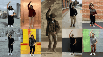
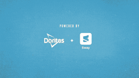
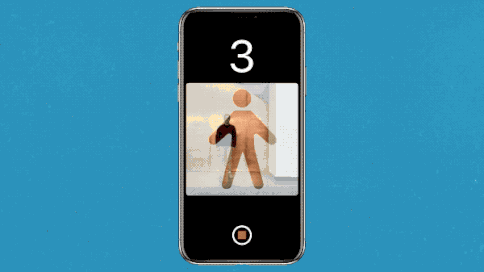
Sway: AI Dance
Product Design · 2019 · Now at Roblox
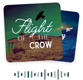
Slumber: Sleep Stories
Product Design · 2022
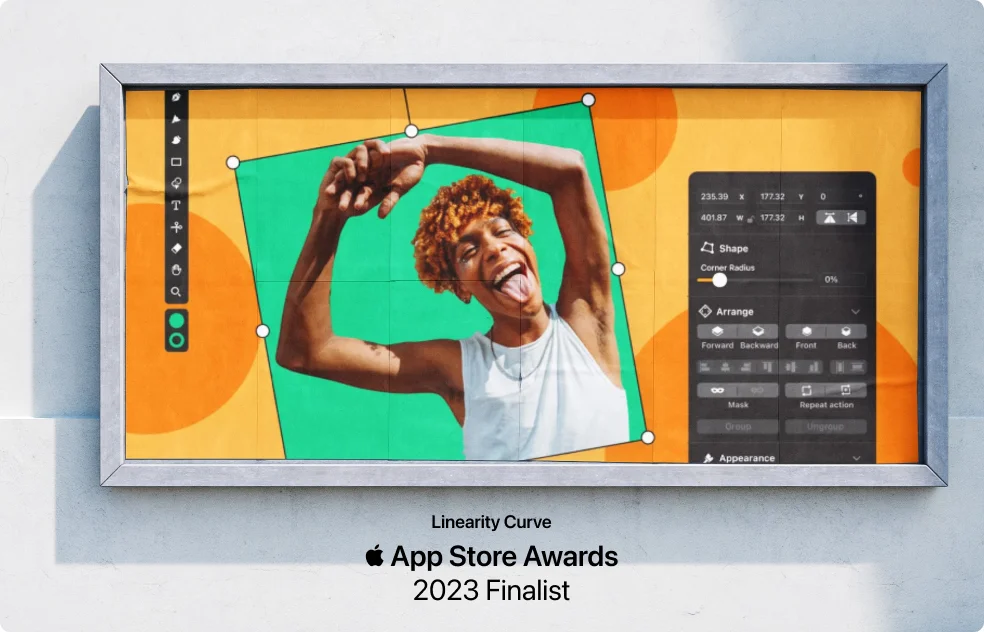
Linearity Curve
Senior Product Designer · 2023 · Formerly Vectornator
Featured by Apple on the new MacBook Air (2025)
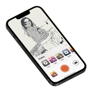
Olli by Tinrocket
Product Design · 2019 · Living Illustrations
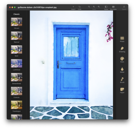
Waterlogue Pro
Product Design · 2017 · Tinrocket
Pleeq Software
Co-Founder & Lead Designer · Since 2013
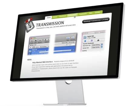
Transmission Web
Web Design · Project is in Archive
Recommendations
Alex was our first design contractor for our flagship app Sway, and his early contribution was a major factor for our smooth, user-friendly UI that eventually led to the big success — peaked at #3 overall in the app store chart — of our mobile marketing partnership with Doritos / Lil Nas X / Sam Elliot for the Super Bowl 2020 campaign.
Alex is hardworking and possesses all the necessary skills that make a great app designer. Moreover, his
programming/technical background is rare to find in most designer candidates on the market. I truly enjoyed
working with him and would recommend him to anyone looking for a highly-skilled and motivated designer.
Tinghui Zhou
Generative AI at Roblox
Tinghui Zhou
Generative AI at Roblox
"Alexander is an amazing and empathetic designer. He helped refine our UX across multiple apps in a short period of time, creating modern and intuitive designs for high-user applications. He adapted quickly when new projects required fast action, helping with marketing activities, website redesign, and new logos."
"Alex is a thoughtful designer and wonderful person. Over many years, we have worked together on several mobile and desktop products at Tinrocket. Alex doesn't just design visuals: he researches the user experience and design problems we need to address and produces great solutions."
"Alexander has been assisting with the localisation of our iPad app Inkpad for three years. He has always been professional, helpful and prompt with his responses, often providing insightful and constructive feedback that led to improvements for all languages."
"Alex is one of such people that believe that beautifully designed hardware products deserve perfectly crafted apps. I even suspect he is using a magnifying glass to check the app UI is pixel perfect. A person of passion, meticulous designs, always available and helpful."
Public Speaking


Press Mentions
-
TechCrunch
(USA)
Cinemin app
-
Olhar Digital (Brazil)
Pleeq Bookmarks
-
Financial
Review (Australia)
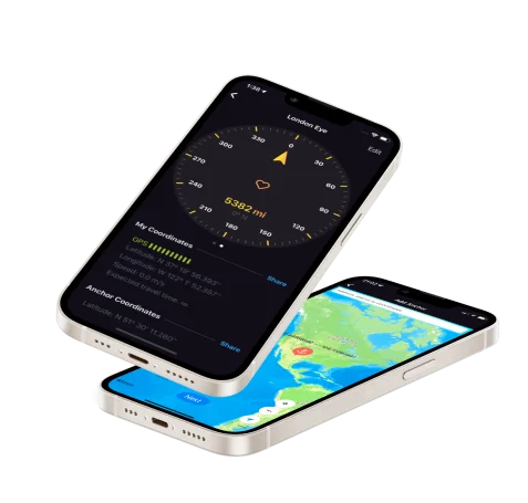
Anchor Pointer
-
Engadget
(USA)
Anchor Pointer
-
TheNextWeb
(USA)
Anchor Pointer
-
UI Graphics Magazine
(Japan)
Olli
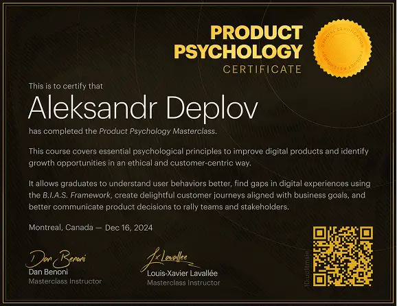
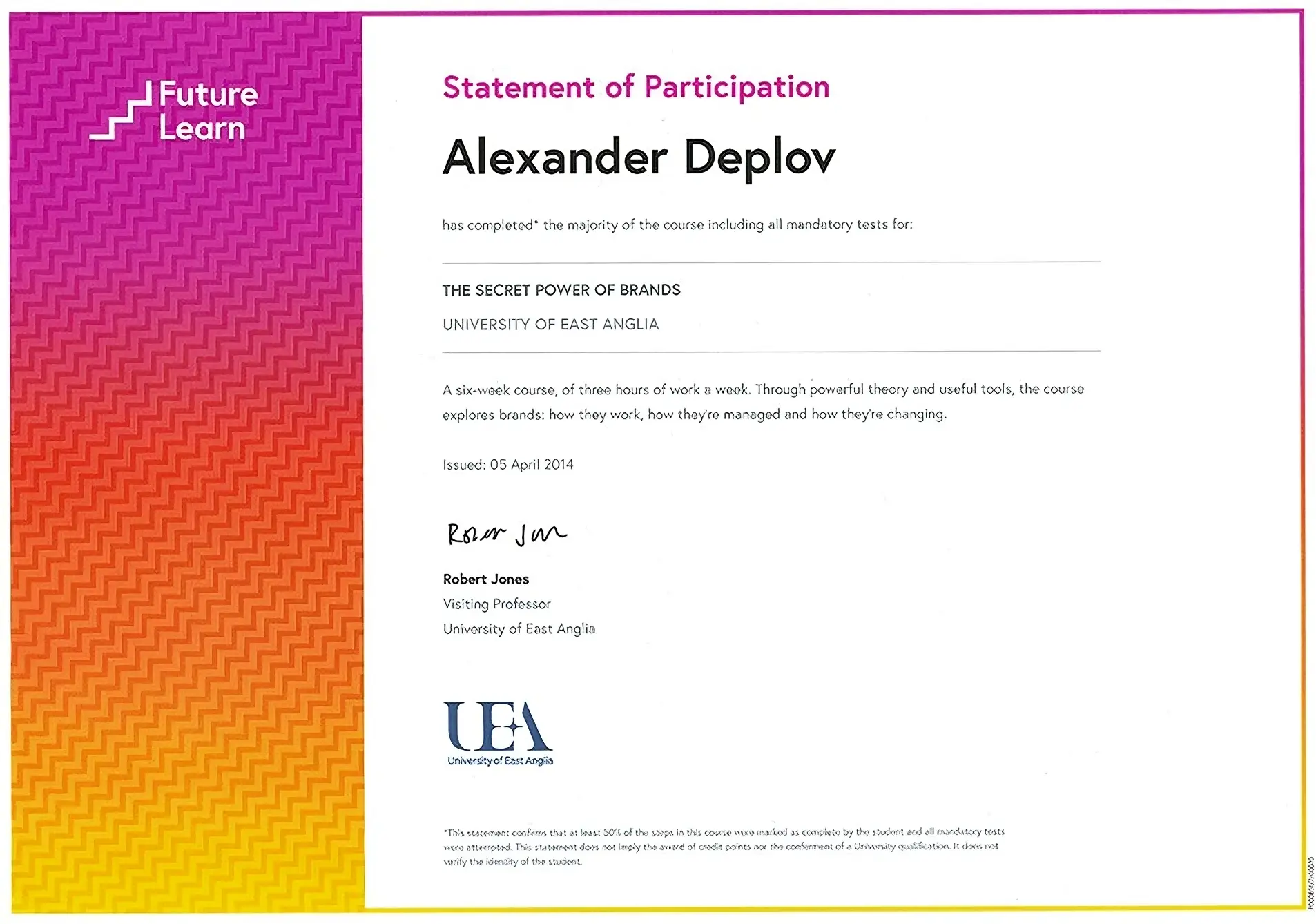
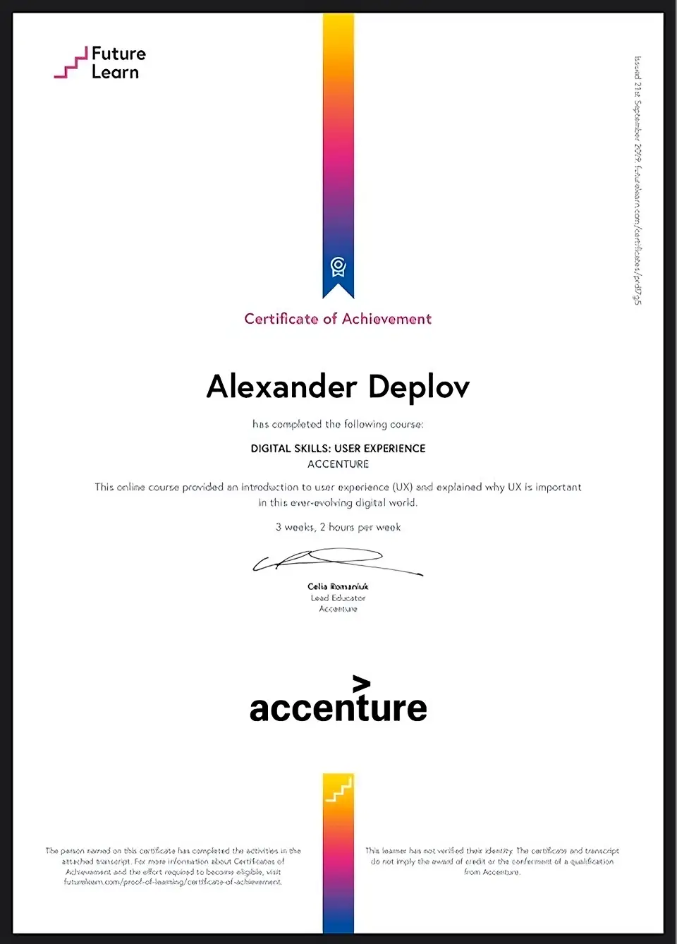
Licenses & Certifications